


Best Responsive Website Templates for Bloggers and Businesses
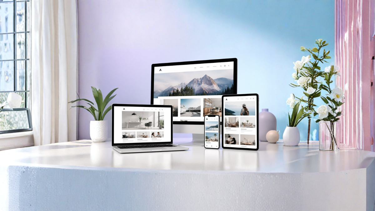
In today’s digital world, having a professional and responsive website is essential for bloggers, startups, online stores, agencies, and businesses. A responsive website template helps your site look attractive and function smoothly on desktops, tablets, and smartphones. Since most users browse the internet using mobile devices, responsive design is no longer optional. It has become a necessity for improving user experience, SEO rankings, and online visibility.
Whether you are launching a personal blog, a business website, a portfolio, or an eCommerce platform, choosing the right responsive website template can save time, improve performance, and create a modern online presence. In this guide, we will explore the best responsive website templates for bloggers and businesses, their benefits, features, and how to select the perfect one for your website.
What Are Responsive Website Templates?
Responsive website templates are pre-designed website layouts that automatically adjust according to the screen size and device type. These templates use flexible grids, responsive images, and CSS media queries to provide an optimized experience across all devices.
For example, if someone visits your blog on a smartphone, the template rearranges content, menus, and images to fit the smaller screen without compromising readability or functionality.
Responsive templates are commonly used in:
- Personal blogs
- News websites
- Corporate websites
- Online stores
- Portfolio websites
- Digital agencies
- Educational websites
- Landing pages
Why Responsive Templates Matter
Better User Experience
A responsive design ensures that visitors can easily navigate your website on any device. Smooth browsing increases engagement and reduces bounce rates.
Improved SEO Rankings
Search engines like Google prioritize mobile-friendly websites. Responsive templates help improve your search rankings and attract more organic traffic.
Faster Development
Instead of designing a website from scratch, templates provide ready-made layouts that save development time and cost.
Mobile Compatibility
More than half of global internet traffic comes from mobile devices. Responsive templates make your site mobile-ready instantly.
Professional Appearance
Modern templates are designed with clean layouts, stylish typography, and professional sections that enhance brand credibility.
Features to Look for in Responsive Website Templates
Before selecting a website template, you should evaluate the following features:
Mobile-Friendly Design
The template should adapt perfectly to smartphones, tablets, and desktops.
Fast Loading Speed
A lightweight and optimized template improves website speed and user experience.
SEO Optimization
SEO-friendly coding structure helps search engines crawl and index your site efficiently.
Customization Options
Choose templates with flexible color schemes, typography controls, and layout customization.
Browser Compatibility
A good template should work smoothly on Chrome, Firefox, Edge, Safari, and other browsers.
Clean Code Structure
Well-coded templates are easier to maintain and customize.
Security Features
Templates with regular updates and secure coding practices reduce vulnerabilities.
Best Responsive Website Templates for Bloggers
Astra
Astra is one of the most popular responsive WordPress templates. It is lightweight, fast, and highly customizable.
Key Features
- Ultra-fast performance
- Mobile responsive design
- SEO optimized
- Compatible with Elementor and Gutenberg
- Multiple blog layouts
Astra is ideal for bloggers who want a clean and minimal website with high speed and excellent performance.
GeneratePress
GeneratePress is another powerful template known for speed and flexibility. It is suitable for bloggers focusing on content and SEO.
Key Features
- Lightweight framework
- Mobile-first design
- Accessibility-ready
- Easy customization
- Excellent page speed scores
GeneratePress is preferred by many professional bloggers because of its stable performance and SEO-friendly structure.
OceanWP
OceanWP offers stylish layouts with extensive customization features. It is suitable for blogs, portfolios, and business websites.
Key Features
- Responsive layouts
- WooCommerce compatibility
- Multiple header styles
- Fast loading
- Translation ready
OceanWP works well for bloggers who also plan to sell products or services online.
Neve
Neve is a modern responsive template built for speed and simplicity.
Key Features
- AMP compatible
- Lightweight design
- SEO optimized
- Mobile-first approach
- Easy integration with page builders
It is perfect for startup blogs, technology websites, and personal brands.
Kadence
Kadence provides modern design options with advanced customization.
Key Features
- Drag-and-drop customization
- Responsive controls
- Header and footer builder
- Fast performance
- WooCommerce support
Kadence is becoming increasingly popular among bloggers due to its flexible design system.
Best Responsive Website Templates for Businesses
Divi
Divi is a powerful all-in-one website builder and template system.
Key Features
- Visual drag-and-drop builder
- Fully responsive layouts
- Hundreds of pre-made templates
- Advanced design settings
- Marketing-friendly features
Businesses prefer Divi for its flexibility and professional designs.
Avada
Avada is one of the best-selling responsive website templates globally.
Key Features
- Multipurpose design
- Responsive framework
- Built-in page builder
- WooCommerce support
- Advanced theme options
Avada works well for agencies, companies, online stores, and corporate websites.
Porto
Porto is a highly optimized template designed for business and eCommerce websites.
Key Features
- Fast loading performance
- Responsive layouts
- SEO-friendly coding
- Multiple demos
- Advanced customization
Porto is widely used by online businesses looking for speed and performance.
TheGem
TheGem is known for its stylish and creative business layouts.
Key Features
- Modern responsive design
- Creative portfolio options
- WooCommerce compatibility
- High-speed performance
- Flexible page builder support
TheGem is suitable for creative agencies and digital businesses.
Sydney
Sydney is a professional business template with a clean corporate appearance.
Key Features
- Responsive sections
- Full-screen slider
- Google Fonts integration
- Translation ready
- Professional business layouts
Sydney is ideal for startups and local businesses.
Free vs Premium Responsive Templates
Free Templates
Free templates are suitable for beginners and small projects. They provide essential features and responsive layouts without cost.
Advantages
- Budget-friendly
- Easy to install
- Beginner-friendly
Disadvantages
- Limited customization
- Fewer support options
- Basic features
Premium Templates
Premium templates offer advanced functionality, better support, and unique designs.
Advantages
- Professional layouts
- Advanced customization
- Regular updates
- Dedicated support
Disadvantages
- Higher cost
- Learning curve for beginners
If you are serious about blogging or business growth, investing in a premium template is often worthwhile.
How to Choose the Right Responsive Template
Define Your Website Goal
Understand whether your site is for blogging, business, eCommerce, portfolio, or lead generation.
Focus on Speed
A fast-loading template improves SEO and user experience.
Check Mobile Responsiveness
Test the template on different screen sizes before purchasing.
Review Demo Layouts
Explore available demos to ensure the design matches your brand identity.
Verify Plugin Compatibility
Make sure the template supports essential plugins like SEO tools, contact forms, and page builders.
Read User Reviews
Customer reviews help identify performance issues and support quality.
Responsive Templates and SEO
Responsive website templates directly affect search engine optimization.
Mobile-First Indexing
Google primarily indexes the mobile version of websites. Responsive design improves mobile usability.
Faster Page Speed
Optimized templates reduce loading time, improving rankings.
Lower Bounce Rate
Better user experience keeps visitors engaged longer.
Improved Crawlability
Clean coding structures help search engines understand website content.
Better User Signals
Responsive websites often achieve higher engagement and conversion rates.
Common Mistakes When Choosing Templates
Ignoring Speed Optimization
Heavy templates with excessive animations can slow down websites.
Choosing Complex Designs
Overly complicated layouts may confuse visitors.
Lack of SEO Features
Templates without SEO optimization can hurt search rankings.
Poor Mobile Experience
Some templates appear responsive but fail on certain devices.
No Update Support
Outdated templates may create security risks and compatibility issues.
Best Platforms for Responsive Website Templates
WordPress
WordPress offers thousands of responsive templates for blogs and businesses.
Shopify
Shopify provides responsive eCommerce templates for online stores.
Wix
Wix offers drag-and-drop responsive templates for beginners.
Squarespace
Squarespace templates focus on modern and creative designs.
Webflow
Webflow is ideal for advanced responsive website design and customization.
Responsive Design Trends in 2026
Minimalist Layouts
Clean and clutter-free designs remain popular.
Dark Mode Support
Many modern templates include dark mode options.
AI Integration
AI-powered chatbots and personalization features are becoming common.
Faster Performance
Performance-focused templates are gaining more importance.
Interactive Design
Micro-animations and interactive elements improve engagement.
Benefits of Responsive Templates for Bloggers
Bloggers gain several advantages from responsive templates:
- Better readability on mobile devices
- Increased search traffic
- Faster loading pages
- Improved social sharing
- Higher user engagement
A responsive blog creates a professional experience that encourages readers to stay longer and explore more content.
Benefits of Responsive Templates for Businesses
Businesses also benefit significantly:
- Improved brand credibility
- Higher conversion rates
- Better customer experience
- Increased sales opportunities
- Enhanced online visibility
A professional responsive website helps businesses compete effectively in the digital market.
Future of Responsive Website Templates
Responsive web design will continue evolving with advancements in AI, voice search, augmented reality, and mobile technology. Future templates are expected to focus more on:
- AI-driven customization
- Accessibility improvements
- Faster cloud-based performance
- Enhanced security
- Personalized user experiences
Businesses and bloggers who adopt modern responsive templates will remain competitive in the online space.
Conclusion
Choosing the best responsive website template is one of the most important decisions for bloggers and businesses. A well-designed template improves website appearance, mobile usability, SEO performance, and user engagement. Whether you prefer Astra, GeneratePress, Divi, Avada, or any other responsive template, the key is selecting one that aligns with your goals, branding, and performance needs.
Responsive templates are not just about visual design. They play a critical role in search rankings, website speed, and customer satisfaction. Investing time in selecting the right template can help you build a successful online presence and achieve long-term growth.
FAQs
1. What is a responsive website template?
A responsive website template automatically adjusts website layout according to screen size and device type.
2. Why are responsive templates important for SEO?
Responsive templates improve mobile usability, loading speed, and user experience, which help improve search rankings.
3. Which responsive template is best for bloggers?
Astra, GeneratePress, and Neve are among the best responsive templates for bloggers.
4. Which responsive template is best for businesses?
Divi, Avada, and Porto are excellent responsive templates for business websites.
5. Are free responsive templates good enough?
Free templates are suitable for beginners, but premium templates provide better features and support.
6. Do responsive templates improve website speed?
Yes, optimized responsive templates help improve page loading performance.
7. Can I customize responsive templates?
Most responsive templates offer customization options for colors, typography, layouts, and widgets.
8. Are responsive templates mobile-friendly?
Yes, responsive templates are specifically designed to work smoothly on mobile devices.
9. Which platform is best for responsive templates?
WordPress is one of the most popular platforms for responsive website templates.
10. What should I avoid when choosing a template?
Avoid slow, outdated, poorly coded, and non-mobile-friendly templates.
11. Do responsive templates support eCommerce?
Many responsive templates support WooCommerce, Shopify, and other eCommerce platforms.
12. How often should I update my website template?
You should regularly update your template to maintain security, compatibility, and performance.